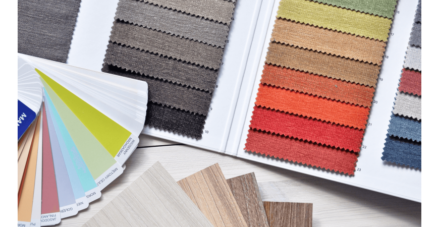
Our homes must have colours to “wear”, too. 2019 is the year of bright colours in vintage pieces of furniture, ethnic geometrical elements and materials such as glass and wood, for a green and responsible choice.
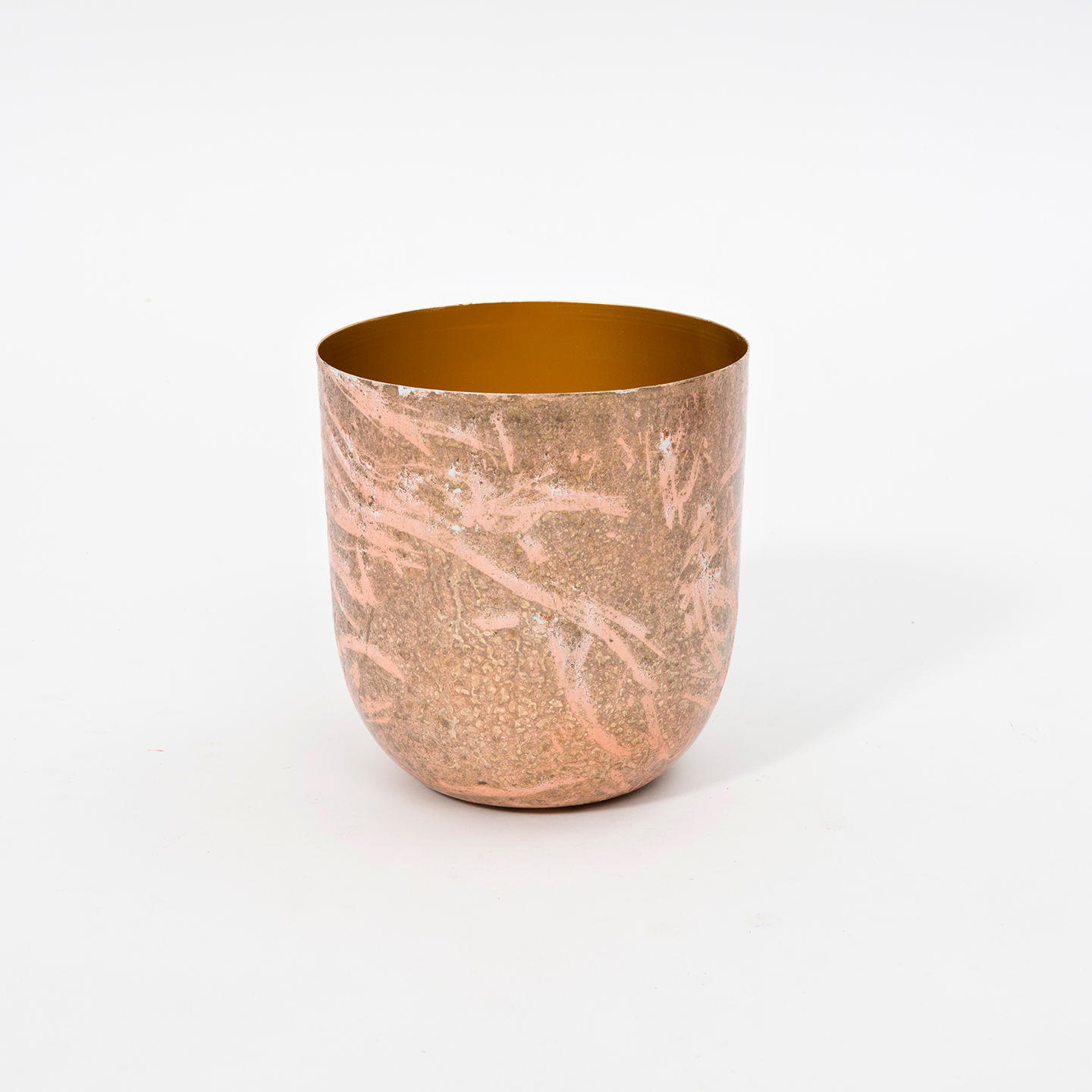
The Pantone Color Institute has announced the Living Coral as Color of the Year 2019 – a delicate shade of coral red tending to peach, whose name leads immediately to environmental protection.New trends move towards warm and vibrant palette, often found is contradictory home décor styles.
Let’s discover together the different shades that you fill find also in our collections:
-
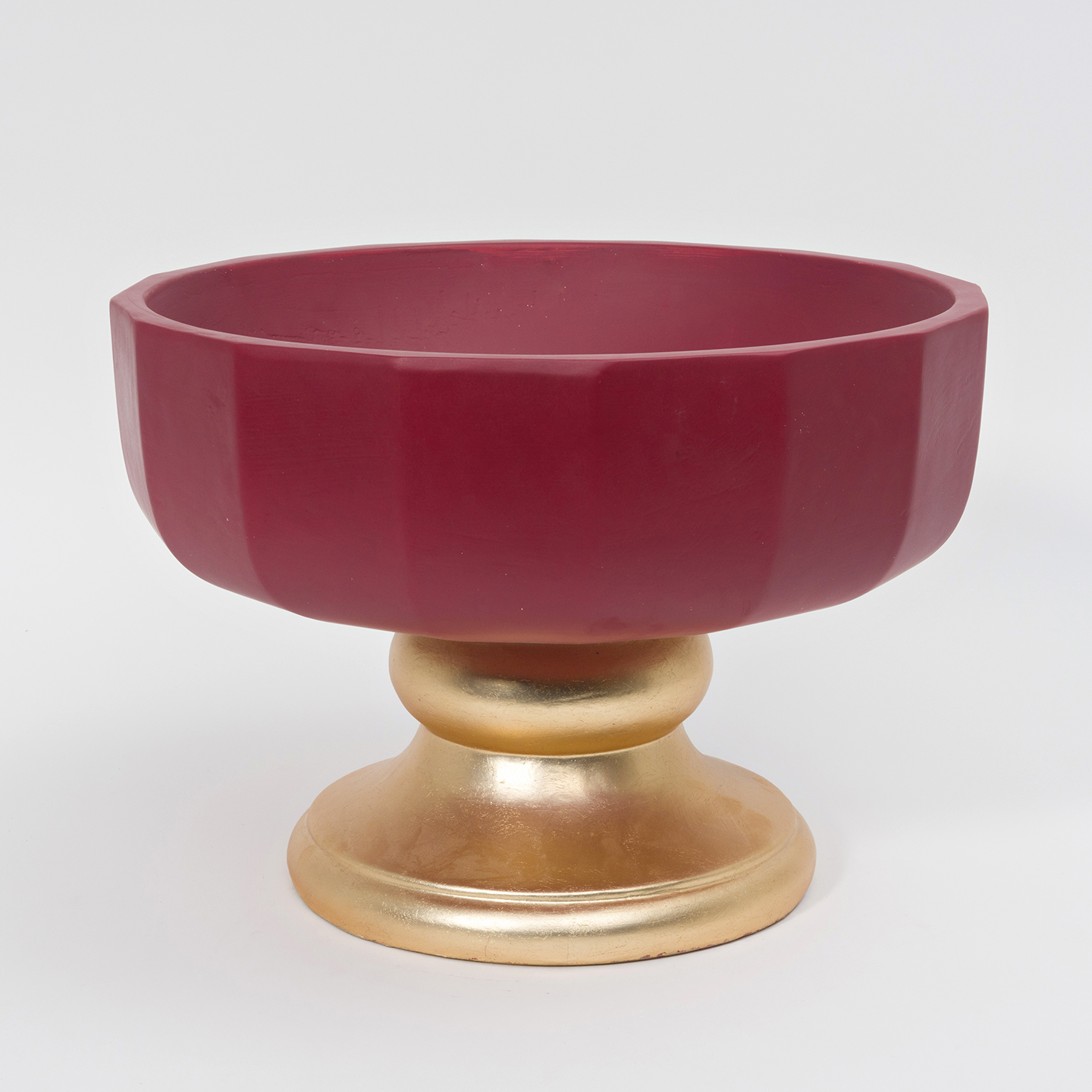
Pomegranate-red: bright and sharp, it gives brilliance to all materials. At the same time, it is balanced and genuine if combined to neutral colours.
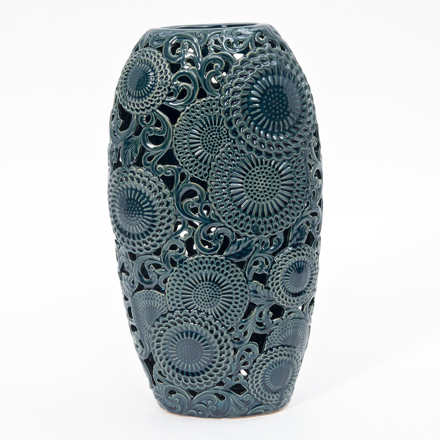
- Opal-green: the green colour has plenty of different shades, giving dynamism and freshness to furniture elements. Its main property consists in the capability of evoking peacefulness and calm, perfect for home décor living.
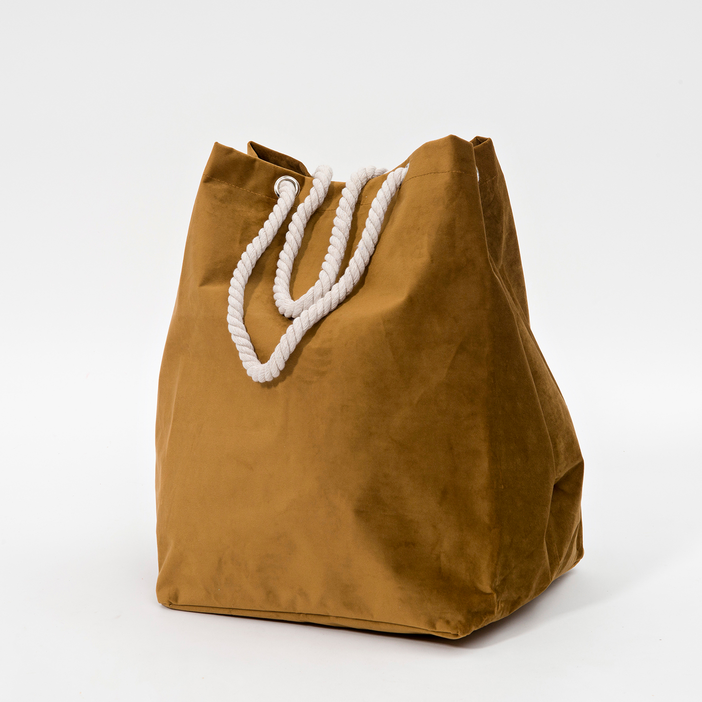
- Caramel: beige in its most intense nuances, evokes elegance, delicacy, brightness. It is the perfect balance between vintage and avant-gardism.
-
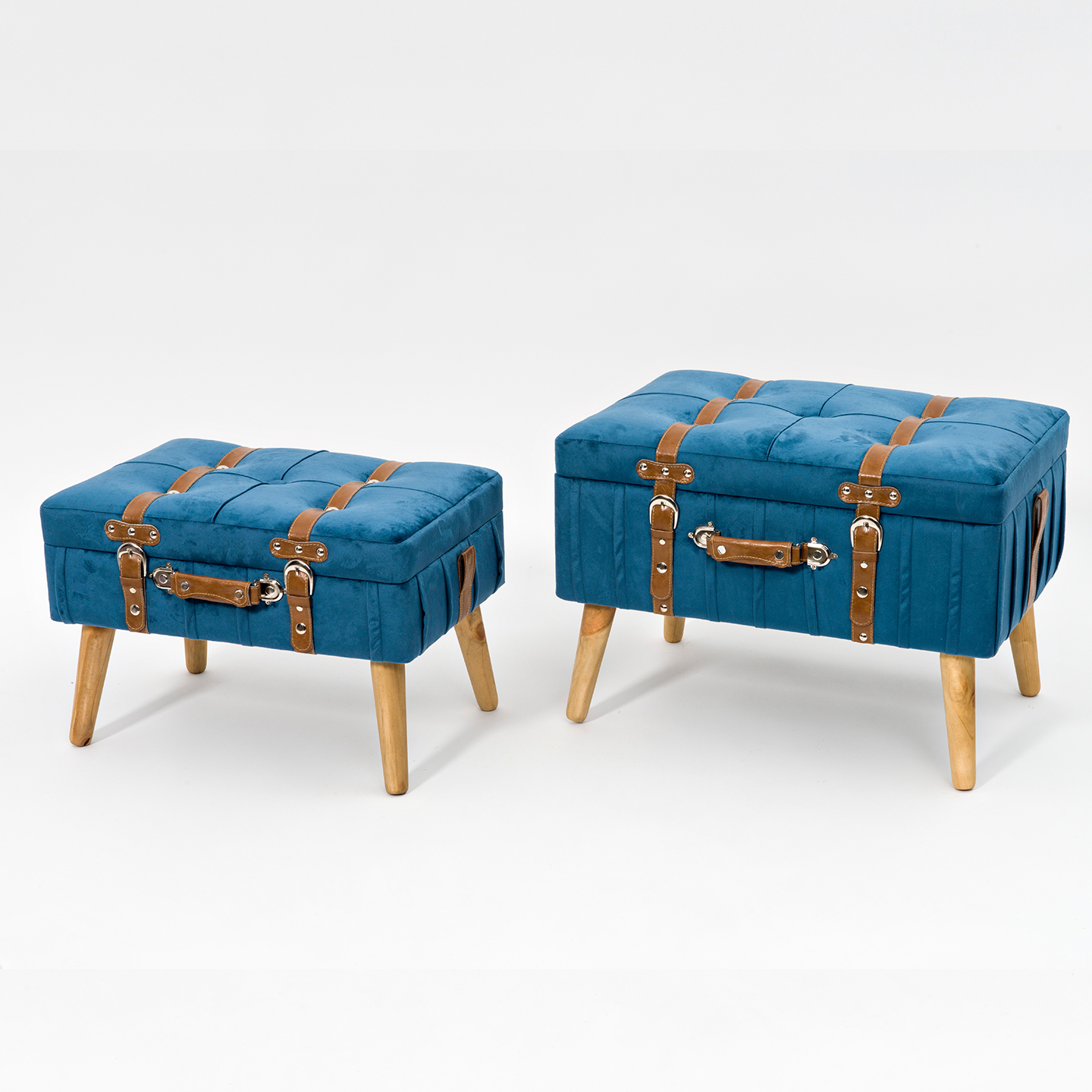
Blue: this colour in all its nuances – from light to dark – gives a real modern impact, above all if combined to bordeaux and purple. The result will be a sophisticated rigorous style.
- Dusty rose: perfect for minimal-effect elements and relax areas, with a touch of elegance.
